Here is the link to Emma and my food blog: http://zkortenhof.wix.com/cookingwithangst
Wednesday, January 27, 2016
Margaret Bourke-White
Margaret Bourke-White was an American photographer, she was a documentary photographer who was born in 1904 and died in 1971, she died of Parkinson's disease. She was the first female American war photo journalist. She was also the first photographer ever to be permitted to take photos of Soviet industry. I particularly like her work because of the pivotal time period she came from, and the influence that had.
Here is another image by Margaret Bourke-White. I really like how this image is taken from above and how all of the people in the image are uniform and look like little tiny dots.
 |
| Hats in the Garment District Margaret Bourke-White, New York, 1930 |


Wednesday, January 6, 2016
Portland Jazz Festival
The following are posters/album covers/images I've found that I like and are inspiration for the jazz festival posters that we will be making. I found that I like the black and white posters and also things with Mt. Hood in the background. I also found one image of the stereotypical Portland hipster on it with a completely yellow filter and I thought it could be cool if the hipster had a trumpet or something.
 |
| Beaver & Mt. Hood, Portland Oregon http://www.allposters.com/-sp/Beaver-Mt-Hood-Portland-Oregon-Posters_i3147308_.htm |
 |
| Vinyl Jazz Funk Poster http://www.zazzle.com/vinyl_jazz_funk_poster-228773447926282887 |
.
 |
| All That You Can't Leave Behind, U2, Album Cover, 2000 |
 |
| http://blog.estately.com/2012/09/northwest-hipster-showdown-seattle-vs-portland/ |
 | |
|
Sunday, December 13, 2015
Fine Art Food Photography


Fine Art vs Editorial Food Photography

Citations:
Davies, Dominic. Fat Duck. 2012. Web. 13 Dec. 2015. <https://www.finedininglovers.com/photo/food-photography/davies-photography/dominic-davies-photos/>.

Tuesday, December 1, 2015
Time/Step Out
I found this video made by a guy called Andrew Studer. He made the film when he was 17. The time lapses in the film inspired me and made me want to make a compilation of time lapse videos. I am thinking that for one of my next projects I might try it out. It would work well with my thesis of exploring and wandering. Not only that but the concept of time is also fascinating, it comes to play with exploring and not letting time get in the way of going out and doing interesting things.
"Time", Andrew Studer, 4:02 min, Film
He made a second film called "Step Out" that I really enjoyed as well. The idea of getting out of school, the house, your bed, and going and seeing something awesome is a concept I really like. So often we let school and homework get the better of us and we use it as an excuse to not go and "Step Out." This again relates nicely to my thesis.
"Step Out", Andrew Studer, 3:36 min, Film
Friday, November 6, 2015
Digital Transfers
For the next part of the postcard project we are doing digital transfers. The pictures I plan on using are landscapes I took in the Indian Heaven Wilderness.


Sense of Place
My idea of a sense of place is a place that you feel connected to, or a part of in some way. For example, when I'm backpacking and you are far enough in the wilderness that you can't hear sounds like highways and other human noises, I feel a sense of place. I spent a lot of the summer traveling, and I found while sightseeing it was very hard to have a sense of place, but when I stopped and interacted with locals, and lived with families from that place, it was a lot easier to feel a connection to the culture and to the place itself. Here are some pictures I took while backpacking, they represent my feeling of sense of place.


Thursday, October 15, 2015
New York
I recently got back from New York. We went on a crazy museum streak and we visited The Met, MOMA, Copper Hewitt, Museum or Art and Design, Museum of Natural History, Parsons (The New School), The Whitney, The Guggenheim, we explored the High Line and went to the top of the Rock. Here are some the the pictures I took.


Tuesday, October 6, 2015
Food
I might be little ahead of the game here, but the project after the post card project will be a food photography project. I am not entirely sure of the specifications of the project, but I've been brainstorming ways I could connect this to my thesis for the year. I was thinking a lot about food from different places, and how it is important to explore foods and try new things while wandering and adventuring. Then I had the idea of cooking food and plating it in the shape of the country of origin. I'm not entirely sure how good this idea is but I wanted to write it down before I forgot it. I did a little research and found some examples of things that are similar to my idea. I also found some interesting food collages that I liked.
 |
| Julie's Kitchen, Food, Food Collage, Digital Photography |
 |
| Julie's Kitchen, Food, Food Collage, Digital Photography |
 |
| Andrea Bricco, Casa de Perrin, Food and Plating |
 |
| Andrea Bricco, Casa de Perrin, Food and Plating |
IB Thesis
In IB Art we choose a thesis for the year. This year I am going to be incorporating the theme of wandering and exploring into my art. Here is a link to my thesis presentation:
Zanna's Thesis Presentation!!
Zanna's Thesis Presentation!!
Postcards
The next project we will work on is a postcard project. We will be taking film we shot over the summer (I will be using photos from Italy) and creating a series of postcards. I'm thinking about using this series of door pictures I took while I was in Italy. I will print 7-10 pictures of different doors that I took pictures of and I will apply different printing methods. I will make a cyanotype for one postcard, a gum bichromate for another, scan some images into the computer and edit and print it digitally, I will print some on semi-matte paper and hand paint them. This works really well with my thesis for the year (my thesis is wandering/exploring).
 |
| Julian Smart, Untitled 1, Gum Bichromate |
 |
| Pirkko Holm: Map 2, multiple coated cyanotype |
Appropriation: Banksy
In class we are studying art appropriation. Art appropriation is the idea of using previous works of art to create something new, intentional borrowing or copying of a pre-existing work. Below are some of Banksy's works, he has taken existing works and altered them. He has altered the work to communicate his slightly satirical message.
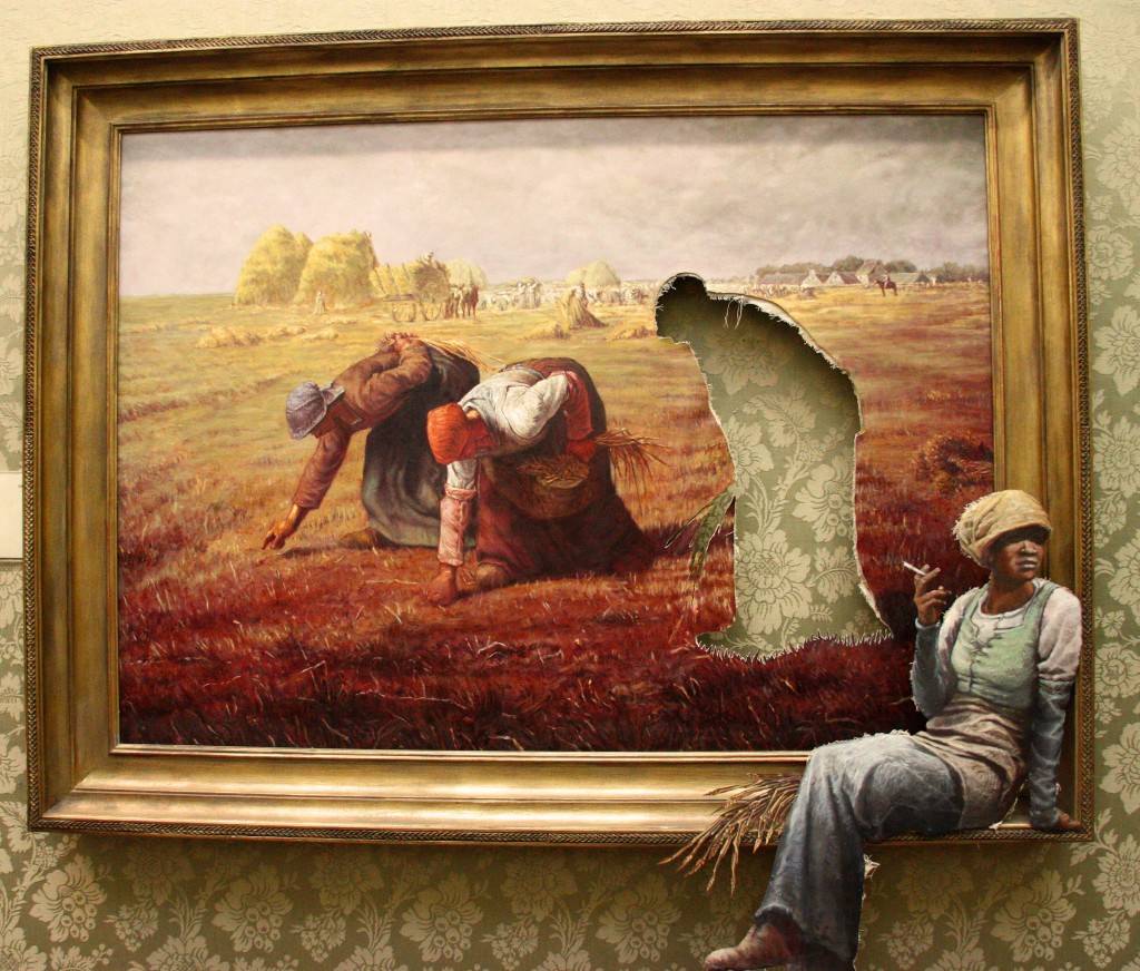 |
| Banksy, untitled, appropriation of Millet's “The Gleaners” mixed media. |
 |
| "Banksy of England" Banksy |
 |
| "Show Me Monet" Banksy |
Dustin Yellin
I found this Ted Talk by the artist Dustin Yellin. He creates 3D sculptures with many layers of glass. I think for a future project I might print on multiple sheets of glass and create some sort of image created when I put the sheets of glass back to front.
 |
| Dustin Yellin, "Psychogeography 43" mixed media, glass, 2014 |
Final Draft Part 1
This is the final draft of our first project.

Analog Photo, Glossy Fiber Based Paper, 11x14
Monday, September 21, 2015
Paper Types
This is information on paper types that I found on this website.
Paper Types
There are two general types of paper as well. The first is fiber-based paper (often shortened to FB). Fiber paper is known to produce really good tones and be very stable after processing. Museums and exhibitions often use this paper for prints due to the quality and archival nature. On the downside, due to the porous nature of the material, it takes a longer time for chemicals to saturate the paper fully. Fiber paper is also very fragile when wet, so it has to air dry as opposed to being dried in a machine.
The other type of paper is resin-coated paper (often shortened to RC). RC paper is quick to process, but slightly less stable after development. Because the chemicals only affect the outer layer of the paper, the developing and fixing process is quicker. It’s also much sturdier, so the paper can be dried in a matter of minutes using a rolling drying machine instead of hours or days hang drying or screen drying.
Paper Finishes
Glossy
 |
| Glossy Paper |
A glossy finish has a high reflectivity and smooth texture. It gives the impression of richer contrast and emphasizes the details and sharpness of an image. Even slightly out of focus images can look really bad on glossy paper. High contrast images also often look too surreal or odd on glossy paper. When displaying your prints, glossy paper needs to be positioned carefully in relation to light sources or glare will make viewing the image difficult.
Matte
Matte paper has a rougher texture and low reflectivity. It tends to mask imperfections and provide a softer look. In contrast to glossy papers, if an image is driven by sharp details, it will look significantly less dramatic on matte paper. Sharp images tend to look a tiny bit soft when printed on matte paper. It looks absolutely great behind the glass of a frame since the texture allows a microscopic bit of space between much of the surface and the glass itself.
 |
| Matte Paper |
Semi-Matte, Luster, Pearl
 |
| Semi-Matte Paper |
There are a number of finishes that fall in between glossy and matte: not totally shiny, but not totally rough. Depending on the brand and the type of paper, these finishes may be called semi-matte, luster, pearl or satin. For the vast majority of images, these in-between finishes work wonderfully. Of course, your final choice of finish will be based on your personal preference. Most darkroom-savvy photography have one or two favorites. You’ll rarely see a museum exhibition where each photo is printed on a different paper, so the choice isn’t normally based on the content of the images. Once you start printing for yourself, you’re sure to find one that fits your style.
Book Making
We started the year by learning about Japanese book binding techniques. These are some examples of some books. I tried the standard binding technique and the tortoise shell technique.
 |
| I really liked this one. |
 |
| I made a book with binding similar to the book with orange thread and the blue thread. |
Wednesday, September 16, 2015
Hand Painting
For our first project, one of the photographs needs to be hand painted. I tried out hand painting last year, and I really enjoyed it. Usually hand painting looks best on portraits or landscapes. I am more inclined to hand paint landscapes as I am very interested in the natural world and exploration (I am thinking about maybe having exploration/wandering have something to do with my thesis for IB Art). However, I was also interested in seeing what hand painted portraits look like.
I did some research and discovered a New York based artist named Jessie Dinan. Here are some of her portraits:
I did some research and discovered a New York based artist named Jessie Dinan. Here are some of her portraits:
.jpg) |
| Jessie Dinan |
.jpg) |
| Jessie Dinan |
You can find more of her work on her website: http://www.jessiedinan.com/
Tuesday, September 8, 2015
Landscapes
While in Italy I saw lots of amazing landscapes. I shot mostly on film, but I got a few digitally as well. My host brother and I also had fun playing with the shutter speed to get the lightning on a particularly stormy night.
 |
| Sant'Andrea, Elba Island, Italy |
 |
| View from Capoliveri, Elba Island |
 |
| Costa Corallina, Sardinia, Italy |
 |
| Lightning!! |
Subscribe to:
Posts (Atom)